The following page illustrate the correct handling of the DIMOCO word mark. Our word mark is the anchor of the DIMOCO branding and core to our corporate identity. For this reason, it is of vital importance to use them correctly and consistently.
Logo DIMOCO Payments
LOGO TYPES
The gradient version of the logo should be used primarily. In some exceptions, such as when printing on certain materials, the solid version of our logo must be used since gradients may not have a satisfactory outcome.
LOGO ELEMENTS
Our logos consist of a left-aligned icon and a word mark. The logo is available in two versions: one includes “payments” a descriptor in addition. The version of the logo which includes the descriptor should be used primarily, unless the readability is not ensures, such as in sports sponsoring or small print projects.
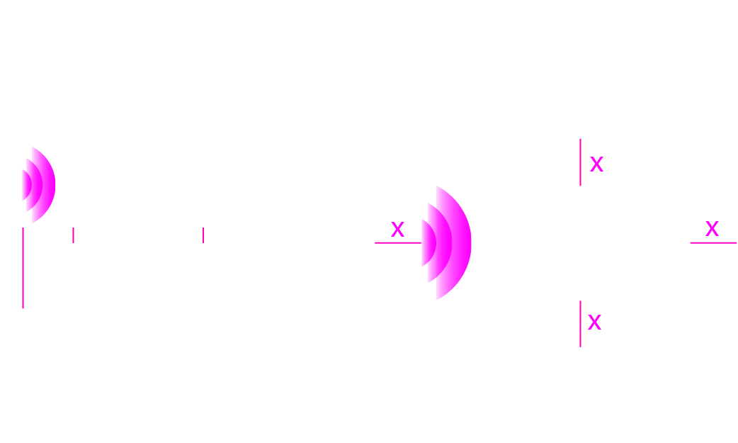
POSITIONING AND CLEAR SPACE
When implementing the logo, being aware of its size and legibility is key. Please observe the clear space around the logo to maximise visual effectiveness. No other elements should intrude into this specified space.
For our athletes we designed a separate sponsoring guide. The logo to be used is the version without the descriptor. This is solely used for sponsoring of activewear sport athletes. Here, we also have the primary used gradient version and a solid version.
Here, we differentiate when the original logo and the solid coloured logo is used. Also, since the logo is placed on mostly textiles and plastic materials, only the solid version must be used.
Please use the following three options in case of cluttered or light, dark or colored backgrounds, including the rectangular backgrounds:
Download Kit DIMOCO Payments Activewear Sport Athletes
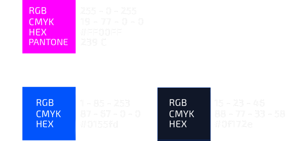
To achieve the ideal pink on printed materials, we optimised our CMYK version to the Pantone colour scheme.
CORPORATE TYPEFACE
Exo 2 is our primary typeface, to be used in all documents (except email content). It sets a modern and dynamic tone for the DIMOCO brands. Other typefaces can be used only when typographic limitations occur (Excel tables, simulations of third-party websites and apps, absence of support for addition al fonts…).